
Updated: January 2022
Published: May 2021
Share on: Twitter / Facebook
The following article provides an overview of covid-19 mortality per country.
A) Excess mortality ⇓ B) Life expectancy ⇓ C) Care homes ⇓ D) Covid vs. the flu ⇓ E) Countries ⇓
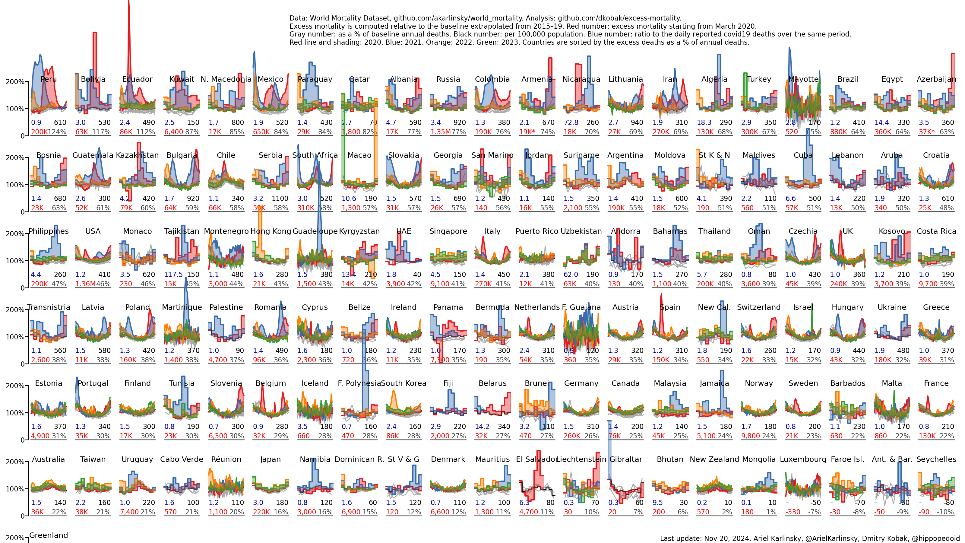
A) Excess Mortality Per Country
The following live chart, developed by Ariel Karlinsky and Dmitry Kobak, shows excess mortality per country, compared to the extrapolated 2015-19 baseline, since the beginning of the pandemic. In most Western countries, the covid pandemic increased annual mortality by about 5% to 20%, but in some Latin American countries, mortality increased by up to 80%.
These figures refer to all-cause excess mortality and may include non-covid excess deaths. Data from the US and the UK indicate that in some countries, up to one third of all excess deaths may have been not due to covid, but due to indirect effects of the pandemic and lockdowns. International economic disruptions may have pushed up to 150 million people into extreme poverty and hunger.
From January 2020 to September 2021, there were an estimated 15 million excess deaths globally, which amounts to a global excess mortality of about 15% (based on 60 million annual global deaths) and a global pandemic mortality of about 0.2% (based on a global population of about 8 billion people). In comparison, the 1918 flu pandemic had a global mortality of about 2.4% (40 million deaths in 1.8 billion people) and a significantly lower average age of death (see below).
Covid mortality depends on the infection rate as well as on demographics (e.g. age structure) and health indicators (e.g. cardiovascular disease prevalence). By the end of 2020, total infection rates ranged between 10% and 30% in most Western countries and between 25% and 50% in many Latin American countries. The following chart shows the total infection rate per country by December 2020, i.e. in the midst of the second wave. (See also: The SeroTracker).

B) Impact on Life Expectancy
Life expectancy is a theoretical concept describing the average age people born in a certain year will reach, assuming that the mortality rate per age of that year will stay constant forever. As a pandemic is a transient event, life expectancy will likely return to its pre-pandemic levels after the pandemic subsides, unless there are significant, population-wide long-term health sequelae.
The following chart, developed by José Manuel Aburto et al., shows the temporary impact of the covid pandemic on life expectancy per country. Specifically, it shows the change in life expectancy in 2020 (negative in most countries), at birth and at age 60, for males and for females, compared to the average yearly change in life expectancy between 2015 and 2019 (positive in all countries).
In most countries, the median age of covid deaths was close to the average life expectancy or even slightly above (e.g. 78 years in the USA and 80 to 86 years in western Europe). Therefore, despite high excess mortality in some countries, the temporary impact on life expectancy in 2020 was limited: it ranged from zero (in countries hardly affected by the coronavirus) to minus 2.1 years in US males.

For comparison, the 1918/19 “Spanish flu” pandemic, which in contrast to covid killed many young people, lowered US life expectancy by about 15 years or 27%, from 55 years to 40 years. Thus, the “Spanish flu” had lowered US life expectancy about eight times more in absolute terms and about 14 times more in relative terms than covid did in 2020 (1.8 years or 2%).

C) Nursing homes
The following chart shows covid deaths in care homes in proportion to all covid deaths, per country. In most Western countries, 30% to 60% of all covid deaths occurred in care homes.

The following chart shows the covid infection fatality rate per age group, in the entire population (left) and the non-nursing home population (right), in the case of hard-hit Belgium. It can be seen that in the general, non-nursing home population, IFRs peak at about 3% (males and females combined). In contrast, IFRs can reach up to 30% in nursing home residents.

D) Covid vs. the flu
The following chart shows US mortality by age in previous pandemic years compared to 2020 US excess mortality, which consisted primarily (>75%) of confirmed and suspected covid-19 deaths, according to the CDC. To learn more about this comparison, please read this article.

E) Countries
Mortality statistics of Sweden, the US, the UK, Italy, France, Germany, and Switzerland.
Comparison: Covid deaths per age group
The following chart shows the percentage of covid deaths per age group in various countries. While in many European countries, up to 90% of deaths affected people older than 70 years of age, in many Latin American countries, up to a third of deaths affected people younger than 60 years of age.

1) Sweden
The following chart, developed by a German analyst based on official data, shows Swedish mortality from 1835 to 2020. Swedish mortality in 2020 was comparable to mortality in 2012 and 2013.

The following chart shows Swedish mortality from August to July (an epidemiological year), which means that the 2020 covid spring wave is part of the 2019/20 period, while the 2020 autumn wave is part of the 2020/21 period.

To calculate Swedish excess mortality in 2020 (compared to statistical expectation), one has to take into account the fact that Swedish mortality has been decreasing since the 1990s, due to strongly falling birth rates between 1920 and 1935, recent immigration, and higher life expectancy. If one extrapolates this decreasing mortality trend, Swedish excess mortality in 2020 was the highest since 1919, although still about seven times lower than in 1918, even without age-adjustment.

Finally, the following chart shows Swedish mortality from 2000 to 2020 by age group. As can be seen, there is significant excess mortality in people over 65, and possibly in people between 50 and 59.

2) United States
The following chart shows US age-adjusted mortality form 1900 to 2020. To take population ageing into account, the mortality of each year was adjusted to the US standard population of the year 2000. US age-adjusted mortality in 2020 was similar to mortality in 2004.

The following chart shows the number of deaths from or with covid (blue) and from all other causes (gray), per age group, from February 2020 to February 2021, based on CDC data:

The following map shows the coronavirus infection attack rate per US state by late February 2021, as projected (i.e. not measured) by Covid19 Projections. The infection attack rate is lowest in the northwestern and northeastern corners (5% to 15%) and highest in South Dakota (47%).

3) United Kingdom
The following chart shows raw mortality in England and Wales from 1840 to 2020.

The next chart shows age-adjusted non-military mortality from 1840 to 2020:

The third chart shows excess mortality compared to the five-year average:

See also: UK deaths in 2020: how do they compare with previous years? (BMJ)
4) Italy
The following chart shows Italian excess mortality in 2020 by age group.

5) France
The following chart shows French daily mortality from 1968 to 2020: in yellow, the 1969 Hong Kong flu; in green, the 2003 heat wave; and in red, the first and second covid wave.

The second chart shows French monthly mortality from 1990 to 2020 per age group (above and below 65 years). Note that in 2020, there were two peaks (first and second wave) instead of one.

6) Germany
The following chart shows yearly German mortality from 1990 to 2020. Germany had an excess mortality of only about 5% in 2020; however, the German covid infection rate was only about 10% by the end of 2020, due to a very mild first wave in the spring of 2020.

The second chart shows monthly German mortality from 1950 to 2020. The highest peak is the the 1969 Hong Kong flu. The 2017/2018 flu wave was also very strong in Germany.

7) Switzerland
The following chart shows Swiss raw mortality from 1900 to 2020.

The second chart shows Swiss mortality by age group from 1971 to 2020. The median age of covid deaths was 86 years. Below 70 years, there was no excess mortality in Switzerland.

The third chart shows Swiss life expectancy from 1880 to 2020, for males (black) and females (red). In 2020, Swiss life expectancy temporarily dropped by 7.5 months or 0.7% compared to 2019 and reached the level of 2015. In comparison, during the 1918 flu Swiss life expectancy dropped by about 10 years or about 20%.
